

We have looked after the main trust websites for Gloucestershire for many years and in many iterations.
When we created the ²gether NHS Trust Website in 2016, as a second generation, we designed the site to be user friendly and with the end users in mind. In doing so we created a fine example of SEO silos and skyscraper techniques which performed really well for search and still does to this day.
This website also went through a vigorous acceptance process which included a lot of user testing with various groups. As ²gether looked after the mental health areas, this involved a lot of actual users, many of whom had physical disabilities and mental health issues. This was a great experience and user testing done right.
Roll on to 2022 and this personal, actual human approach to user testing is still the best there is - be it feedback or better still testing your own users. But this approach has been superseded by industry norms, by NHS pressures and, most of all, by leaps forward in accessibility software. Read on for some hard and fast rules for accessibility, an exploration of our thoughts about accessibility for websites and some general industry trends around accessibility. You can scroll right to the bottom to see our designs. Oh and some top design tips for upgrading your site to make it accessible.
The trend of accessibility
Web design goes through trends, as does the requests from clients of all sizes. For example GDPR was the big talking point over the last few years, and now is the turn of accessibility. Recent pitches and web briefs have all put accessibility high on their list of needs. However accessibility, just like GDPR, needs to be taken in context and the response (or request) does need to be proportional and right for the specific site. A little knowledge is often a dangerous thing.
Web design accessibility in 2022
Web design accessibility has been around for a long time. In 1998, I worked at the BBC and we were required to create a Ceefax style black background, yellow text version of all pages (Here is a Wikipedia link for those too young). Around this time we also had Neilson who caused outrage and scorn for saying that websites should have zero images (and was mocked for using images for bullet point lists). Accessibility standards have been enshrined in UK law for sometime. However, the web industry and more specifically clients have seen a resurgence of popularity in that dreaded word accessible.
I think this is because of a few recent trends, all of them technology based.
The first is that we can all see the benefits of accessibility and may even partake in them regularly. Voice interfaces via Siri or Alexa, as well as other capabilities such as turning your lights on are at root accessibility enabled tools. Your computer has had voice capabilities for a very long time and only in the last couple of years has this technology become mainstream and useful. Google too is a great example of accessibility in the wider context. Google search a tool to make our lives easier, has voice search and as well as helping disabled users of all kinds, it helps all of us, makes us reliant and allows exploration of accessibility software. "Hej Siri, Search Accessibility" works for teenagers, old people and disabled folk.
The same I would argue goes for another UX trend - that night-mode switch on some apps and websites. A fairly pointless gimmick but it does gets users used to having things configurable by themselves and made easier to use.
Lastly, Accessibility standards have been very hard to judge. indeed much of this has been subjective and self marked. It is only now we have software that is able to give a reasonable accessibility score, meaning clients can independently judge the accessibility of their own sites, and compare with their competitors. I am of course referring to Silktide. Still the only kit on the market that gives you the tools to "fix" accessibility and see what you need to do.
It is this tool, in my opinion that has led to this growth in the accessibility for the web. Once there is a public scoreboard then the time is ripe for fixing your site. Silktide isn't perfect. No software solution is. It reads pages it shouldn't, it gets infuriatingly confused by things and has some rules that are impossible to fix. The latest version does allow you to skip irrelevant rules which makes your blood boil slightly less. It also follows that a 100% score does not mean you have a useable, or even likeable, site.
Silktide also comes with some great tools such as spellchecking and I think it is right and proper to include such elements in usability, always a bugbear for big content based sites with many authors. It is expensive but highly recommended. But which should should be accessible - or rather what sites should have the budgets to be made accessible? And what should be the most important factor - a client who wants a sexy, whizzy site, or their colleague who wants a 100% accessibility score?
What level of accessibility do you need?
This is where we have strong opinions. All good web design is about the end users, and therefore the level of accessibility you need should match the companies internal policy AND most importantly of all the end users. If you are a public body such as an NHS Trust or Police Force you should be as accessible as is humanly possible. If you are creating a marketing site then it depends on who you are marketing to - who is your end audience. I am not advocating we should never worry about accessibility for marketing sites - every site should be accessible to some degree. But there are levels of accessibility - read time effort and money - so the highest level needs a buy in by all in the company to maintain that high level. Thus the Practically.io website you are reading has some nods to accessibility but it is not designed or built with accessibility at the forefront. The purpose of the site is to show off our web knowledge, design skills and get folk a little bit excited. And in this regard it is the same as most sites you will find on the web. Perhaps this will, and is, changing. Again it is up to companies to decide what levels they are comfortable with. To quote "The people who should loudest about accessibility are the first to upload a hideous PDF that destroys your score".
With our old ²gether NHS site we probably would have failed the Silktide tests, but we passed the user and device testing.
NHS web design accessibility specifics
In the NHS, there are a few trends as far as web design goes. Firstly, and rightly, there is the move towards more accessible standards. More on this later. Secondly there is a move towards using common tools and providers. Either the Nightingale theme or off the shelf providers. Thirdly, and somewhat contradictory, is the move by NHS trusts to be unique in feel and aims.
The NHS has a lot of sites. It has the main nhs.uk website which is a meta site, and deals with things such as health conditions, treatments and what to do about it. Then there are the Commissioner websites, of which there are a few per county. These are separate bodies who independently look after the quality of care as given by the relevant local NHS trusts. Then, lastly, every county or region has their own NHS trusts - usually an Acute NHS Trust, and a "Community" Trust. The acute trusts look after the 'big' hospitals including Accident and Emergency, serious surgeries, intensive care and child birth. The community trusts look after everything down from this, and up from doctor's surgeries level. So mental health, school nurses, disability, podiatry... Their list of tasks is a long one.
The point is, there are a LOT of NHS websites, each trying to be different to each other. So therefore each trust has their own slogan and branding. However, in the eyes of most "customers" the NHS is the NHS. Unless you are in the system as a patient or practitioner, you imagine the NHS is one coherent organisation. This idea of promoting difference has always been an issue and when we introduce accessibility to the mix this move to difference begins to make less sense.
NHS Moving towards common tools and themes.
One answer to the accessibility problem is to use similar website tools and themes. The move to common themes and tools should be applauded, as long as those tools are cheap, and fit for purpose. The vast majority of those NHS trust sites, in common with the Internet in general use WordPress as their Content Management System (CMS). So therefore an NHS team have created a theme for use on WordPress which they want to roll out to all trusts. This WordPress theme is called Nightingale, and is open source (Aka free). So far so good. We assume this theme should therefore have a high accessibility score as it is based on the GOV.UK design framework.
We have two problems with this drive within the NHS to push this theme. Firstly, as we have seen, a theme that looks the same for all specifically negates the desire of most NHS Trusts to differentiate themselves. I would go further to say if all sites will look the same then they should in fact be one huge site, or feel like one - like the gov.uk site that Nightingale apes. Secondly, the Nightingale theme is really basic and deals only with the most fundamental aspects of what a site needs - some pages and some blog posts. For us to convert the Glos Health and Care site into this theme would mean building from scratch a load of modules that we already have out of the box from a more fully featured theme builder.

The Nightingale theme above has VERY limited functionality and styling opportunities. See nightingale-theme-user-guide and the WordPress Nightingale repo.
Again we like the Nightingale idea and would love to see it progress in a more user friendly and fully featured way. We also would love to help out to answer the individuality problem and perhaps boost the accessibility scores. For us the answer was to redesign the Glos Care website from the ground up, including tidying and taming the extensive content. This is an ongoing process, but we would love to share where we are at so far...
What we learned from designing an accessible site
Design with accessibility in mind.
Seems obvious but if you try to reverse engineer and adapt an existing site you will only get so far. Design it again, build it properly. Not only will the site be more streamlined, those adaptions end up looking pretty icky.
Good build standards = better accessibility
You should be doing this anyway but sometimes it is just not possible to get your page validation perfect - especially when you add in other things such as analytics, ads and the rest.
You can't have everything
It does not follow that if something is accessible then it should be simple and therefore fast. In our experience we had to add extra code that is invisible to most viewers, which in turn means a slower speed. All those funky tricks such as lazy loading again hurt your accessibility. Similarly if your A/B tests on your shop interface, for example, imply that your buttons need to look a certain way, you should not rip up this experiment based on accessibility. You and your client have to decide what is important.
Design in the broadest terms of accessibility
Accessibility is the same as usability, but it includes a wider set of users. So design your pages and site in a way that is accessible to all. For example we changed the structure of the site to created longer pages with concentrated grouping of content. For example the research pages were merged from areas across the the site to be in one long page. We also added an "in this page" navigation menu instead of multiple pages and let folk know if the link will be in this page or away to another with a change in direction of an arrow. Simple, subtle, design tweaks are all that is often needed.
Decide your accessibility level based on your audience
Are you trying to wow people with design and messaging? Or are you a service that offers information to all? If its the latter then yes, aim for as high an accessibility level as possible.
With our recent School of Arts Worcester website, we had to tread a line between attracting design students and looking cool, and adhering to the Universities accessibility guide, and their long term partnership with Silktide. It was difficult but we did get to a 99% accessibility score.
Start with colors
For a designer this is the hardest aspect to deal with. With the NHS and the Art House website we had corporate colors to work with, and these colors broke accessibility rules. There are some great tools out there, including Silktide. A good place to start is either by creating your palette from here: https://reasonable.work/colors/. If that is not an option then think about text links and buttons differently, as we did with GHC buttons.
Start with, or go back to, the brand
Again if you are aiming for an accessible brand you really need to embed this at board level and certainly in your brand guidelines. If you have an accessible site and then folk cannot access your products or site after this, then there is little point. My analogy is having a multi-lingual website with an English only call centre and enquiry lines.
Know that this is a long-term commitment
So your new site has got 90%+ on Silktide? Great! And well done.
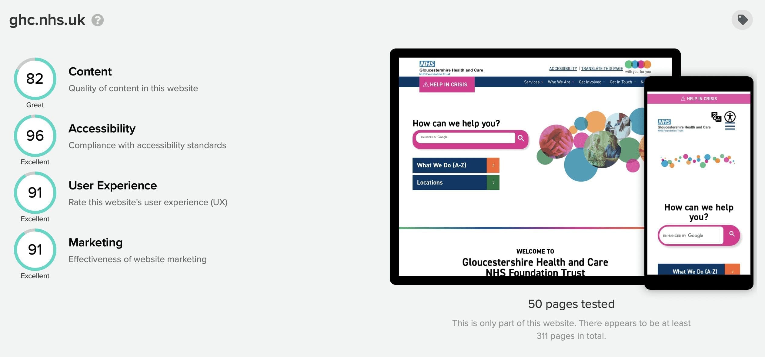
Now comes the hard bit. you have to keep that score sustained even when people upload new content and things to your lovely site. See that anonymous quote above. With The GHC site we have a way to go as we havent started on the pdfs that bring down the score, and have gone down in score since we launched. Client education is important here!
Some basic rules for accessible design
Largely from the W3 guidelines
Provide sufficient contrast between foreground and background
Provide clear and consistent navigation options
Don’t use colour alone to convey information
Provide easily identifiable feedback
Include image and media alternatives in your design
Provide controls for content that start automatically
Create meaningful alt tags and titles
Ensure that interactive elements are easy to identify
Ensure that form elements include clearly associated labels
Use headings and spacing to group related content
Create designs for different viewport sizes
Our accessibility design elements
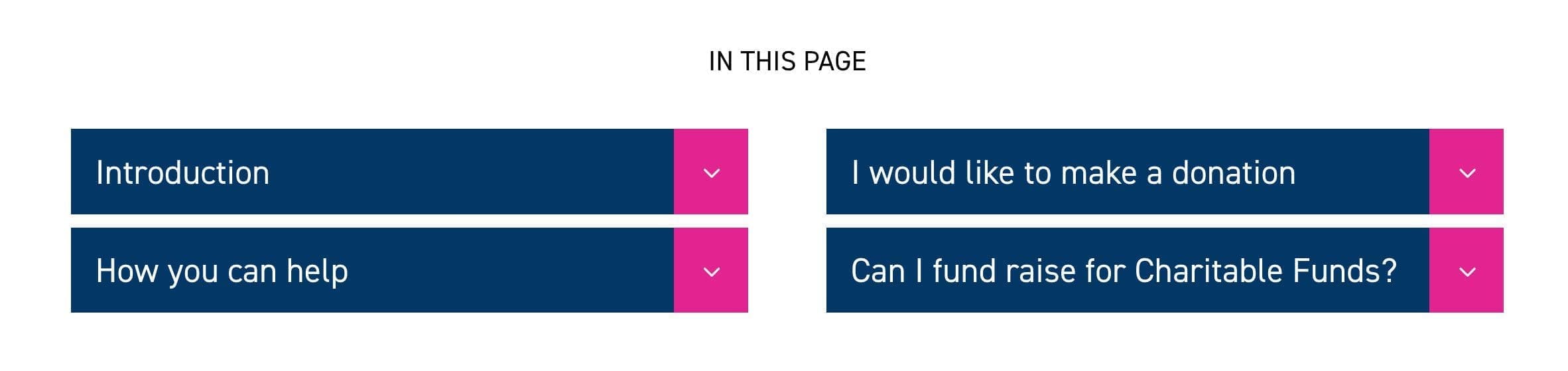
In page navigation
Makes it easier for people of all abilities to see what this page is all about. Links drop down to the sections on the page. This is better for SEO and users than many smaller pages.
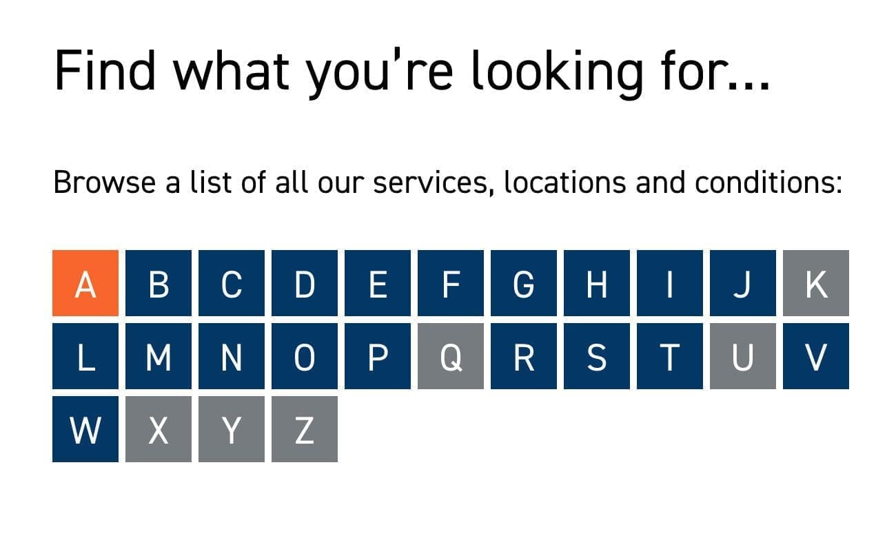
A to Z site listing
Again good usability for huge content sites. People have different names for the same services and content.
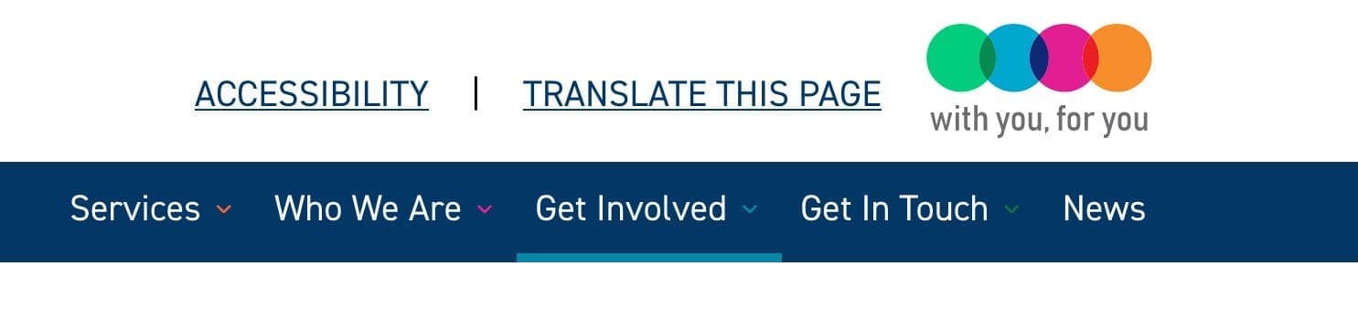
Simple Main navigation
Seems obvious but start at the top. Make sure your site structure and navigation is fit for purpose with a small number of Silos.
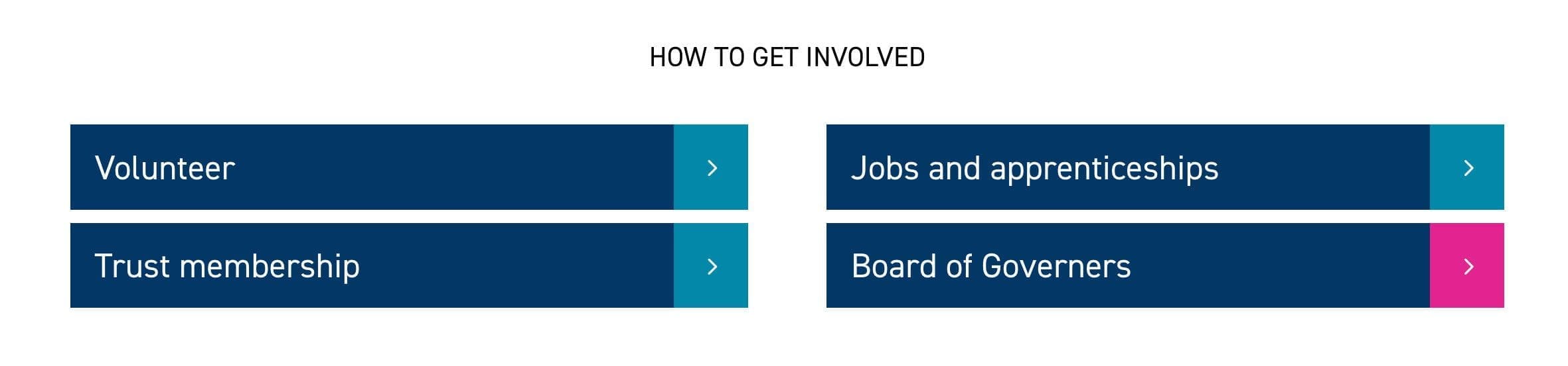
Sensible use of colour
Firstly know that not all colors will work as links. In our case the brand colors are not accessible as text or as links. So think laterally and use color as a non-essential but actually useful maker. In our case the section content has been denoted by the four colours, and links are always black or navy with white.
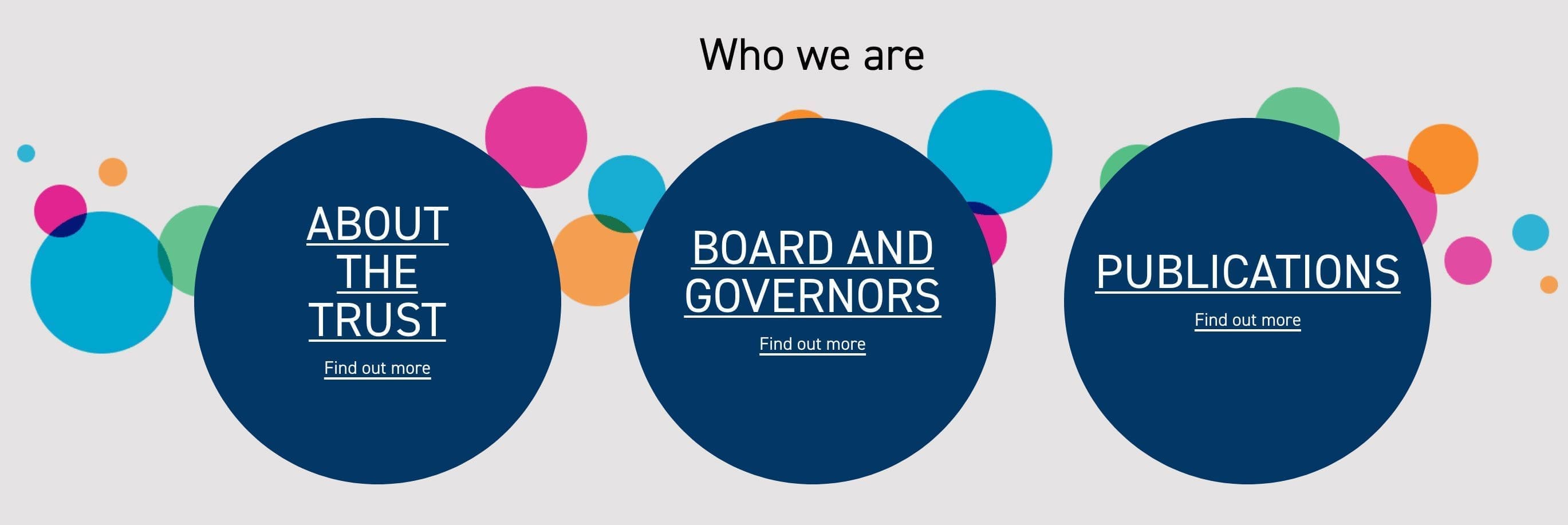
Don't be boring
As a designer you have to work that little bit harder to make an accessible design model. but where possible let your imagination run a bit and aim for some visual flair, without breaking those important rules.
Our accessibility designs


The Merits of accessibility
Accessibility is a great thing. And that there are tools now to egg the industry onward and to help is also a great thing. Our fear is, just like GDPR whose popups have wrecked the experience of using the web on a day-to-day basis, some one high up will shout about accessibility without understanding. Be careful web folks, and let us start the conversation.
From a designers perspective the web often have trends and those trends tend toward homogeny of design. But as we have found, as long as accessibility is there at the start of the process, the restrictions can lead to a great result.